Report Module
Overview
The Report Module serves as a comprehensive tool for reviewing and analyzing the outputs from the Modeling Module. It enables users to delve into various analytical charts, including contribution, decomposition, ROI, spend vs contribution with ROI, Due-to, response curves and effectiveness for the model duration. Users can interact with these charts to gain more detailed insights by clicking on specific areas for a granular view.
This combination of detailed analysis and optimization makes the Report Module essential for users looking to maximize the impact of their marketing efforts.
Creating and Managing Reports
- Default
Report Creation: When a model is published from the Modeling Module by selecting 'View in Report' to
the Report Module, a default report is automatically generated for the
entire model duration. There are two ways to publish a model to Report,
a) By clicking on 'View in Report' from Batch page.b) By clicking on 'Save' from model output page, a popup appears where user has an option to publish the model to the report by selecting 'Publish to Report' option.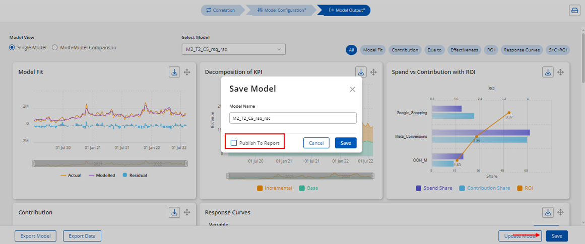
- Creating
a New Report: To create a new report, users should:
- Click on ‘New Report’ at the bottom of the Report Module log page.
- Enter the desired report name in the dialog box.
- Select the model(s) and their duration.
- Click on 'Save and Preview' to create the report.
- Report
Information: Each report in the Report Module displays the following
information:
- Report Name: The name of the report, either generated by default or created by the user.
- Date Created: The date when the report was created.
- Models Used: The models that were used to create the report.
- Default Selection: Must be selected to make the report available for publishing to the Simulation Module. Note: User must select only one Report as default selection to enable the Report to publish it to Simulation. For example, if there is Report_001 and Report_002, if user selects 'Default Selection' for Reprt_002 then publishes both Report_001 and Report_002 to Simulation by selecting the 'Simulation' check box, in Simulation, user can use both Report_001 and Report_002 to create a Session and run Scenarios, user doesn't have to click on 'Default Selection' for Report_001 again.
- Simulation: Indicates that the report has been published to the Simulation Module. Note: Before publishing a report to the Simulation Module, users must open the report, load all charts including response curves, and then proceed with publishing.
- Edit
Icon
: Used to edit the report's configurations.
- Output
Icon
: Used to open and view the report.
- Delete
Icon
: Used to delete the report.
Report Output
Dashboard View: When a user opens the output of a report, they are directed to the dashboard page, which mirrors the layout of the Modeling Module dashboard but includes additional key figures such as spend, total revenue, incremental revenue, incremental ROI and It also includes additional charts like Budget Allocator and Optimized Revenue.
All these charts on the dashboard are generated by default for entire model duration and user has the flexibility to view the dashboard for the subset duration of the model duration by user 'Period' dropdown.
1.
Contribution - The contribution chart is a crucial output of the model as it shows whether the estimated contributions of each measure align with business expectations.
2. Decomposition - It allows the user to view a trend or area-chart depiction of how the individual variable contributions have varied on a daily, weekly or monthly basis. There is an option to export the decomposition data on the chart.
3. Effectiveness - This chart shows how different marketing drivers contribute to the dependent KPI for each unit of investment or support. By default, the effectiveness is displayed for Impression variables if the units are set during the variable properties step. This chart is applicable only for incremental variables.
4. Spend vs Contribution with ROI - The chart provides a visual comparison of how different marketing drivers perform in terms of investment, impact (how much each driver contributed to the desired outcome) and the ROI. By comparing these metrics, the chart helps users understand which channels are delivering the best returns for their spend. It highlights where marketing spend is efficient, such as channels with a high contribution and ROI relative to their spend, and where it may be inefficient, like those with high spend but low ROI.
5.
Response Curve - This chart
shows the average returns curve for all media tactics in the model. The y-axis
represents average return, while the x-axis shows spending as a percentage from
0% to 300% in 1% increments. The dotted vertical blue line marks the 100% spend
level, representing the historical spend for each media tactic.
To view details for a specific tactic, click the curve specific to the variable/tactic. And on clicking the curve the second time, it will display the optimal zone highlighted in green on the curve and clicking or drilling down third time will displaying the KPI curve from 0% to 300% of base spend, including Average Returns (AR) and Marginal Returns (MR) curves. The optimal spend range is between the peaks of the MR and AR curves.
Snippet
depicting optimal zone (a) -
For example,
with google_shopping, the optimal range is 22% to 39% of base spend as shown in
the screenshot (a) above. The data grid below the chart shows the average spend
and revenue for the tactic.
While the response curves suggest an optimal spend range, consider relative ROIs and base spend levels for a comprehensive budget allocation decision.
6.
Due-To - The due-to chart displays the difference in the dependent KPI across 2 aggregated periods and explains the key drivers of the growth or decline between those periods. The user can drill down to a specific driver in the data grid to see the support values for the 2 aggregated periods.
7.
ROI - The chart displays the ROI for media variables while also illustrating the amount spent during the same period and the associated media costs that contributed to achieving that ROI for media variables.
8.
Budget Allocator - This chart allows users to optimize resource allocation by applying 50-150% constraints on each variable's budget while keeping the total marketing budget locked at 100%.
9.
Optimized Revenue/ KPI - This chart displays the optimized Revenue/KPI after budget optimization is run. Once the optimized spend is applied, the corresponding Revenue/KPI is recalculated and shown in the chart. It highlights the difference between the initial and optimized values, demonstrating the impact of the budget reallocation process.
a) For the projects with more than 50 variables, response curves are displayed at an aggregated level.
b) If the user has set the units as impressions in the variable properties, the effectiveness chart will be defaulted to showing impression variables.
Expanded View: All the charts can be viewed at
expanded view individually and users are allowed to compare up to four
different periods simultaneously in the expanded view. Additionally, users can drill down into the charts at the group level using the group dropdown, which provides options such as 0, 1, and -1. Note: If user needs to drilldown to group 2 from group 1 then user will have to drilldown manually.
Other Features
- Custom
Periods: Users can create custom periods using the period dropdown and
clicking on ‘Create New’.
- Manual Chart Drilldown: Users can manually drill down into the chart by clicking on specific sections. For example, if the chart displays a pie with base and incremental contributions, clicking on "incremental" will drill down into further details, such as media and non-media categories. Drilling down into "media" will provide another level of detail, such as separating "digital" and "traditional" media. This feature allows users to explore data at various levels of granularity.
- Multi-Dimension
Reports: If the report includes multiple dimensions, users can use the
"Select Dimension" filter to focus the report output on a
particular dimension.
Related Articles
Simulation Module
Overview The Simulation module allows users to run different "what-if" scenarios or algorithm-driven budget optimizations to understand the best way to allocate the available marketing budget across different marketing channels. By analyzing ...Modelling Module
Overview The Modelling Module is a key component of the Demand Drivers tool, specifically designed to help users create, configure, and run marketing mix models to assess the impact of marketing activities on business outcomes. Here’s a detailed look ...Introduction to Input Module
Introduction The Input Module provides users with essential features for the data ingestion process, including support for various file types and formats. After creating a project and selecting the project title, users will enter the Input Module, ...Guide to the All Projects Screen and Project Creation Process
All Projects Screen When you log in to the URL, you will land on the All Projects page. When you log in for the first time, you may see a blank page with only a ‘Create New’ button at the top right-hand side of the screen. If you have created ...Frequently Asked Questions
All Projects Page What is the All Projects page? The All Projects page is the landing screen after logging in, showing all your projects. Initially, you may see a blank page with a ‘Create New’ button if you have no projects. Projects are displayed ...